In this section, we will go over each element found within the “Design” tab inside your app editor.
To help you get started, we’ve embedded a video overview below. If you prefer step-by-step screenshots, those are available below the video.
 |
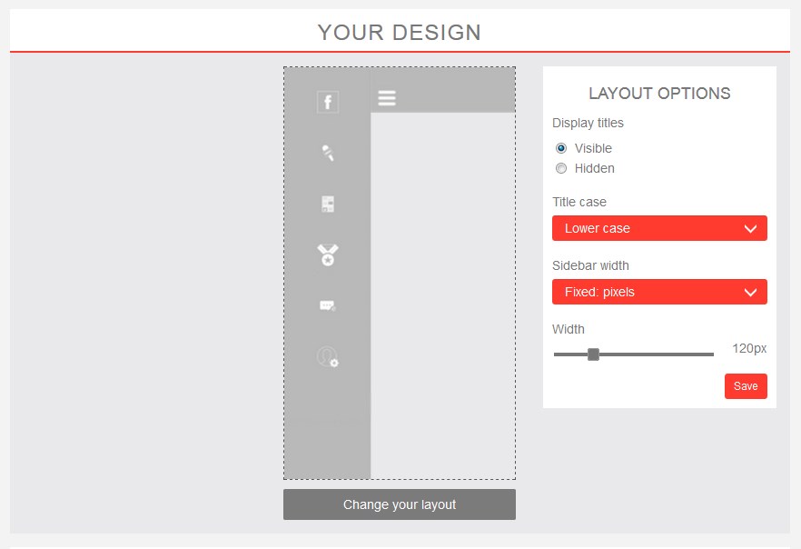
Layout The “Layout” determines how your app’s menu will look. There are several unique options, and you can switch between them at any time. To make a change, just click “Change your layout.” Directly to the right of the layout selector, most layouts have options you can edit. Some layouts will allow you to add image rotators, show/hide menu titles, and more. Feel free to experiment and find a style that works for you! |
|
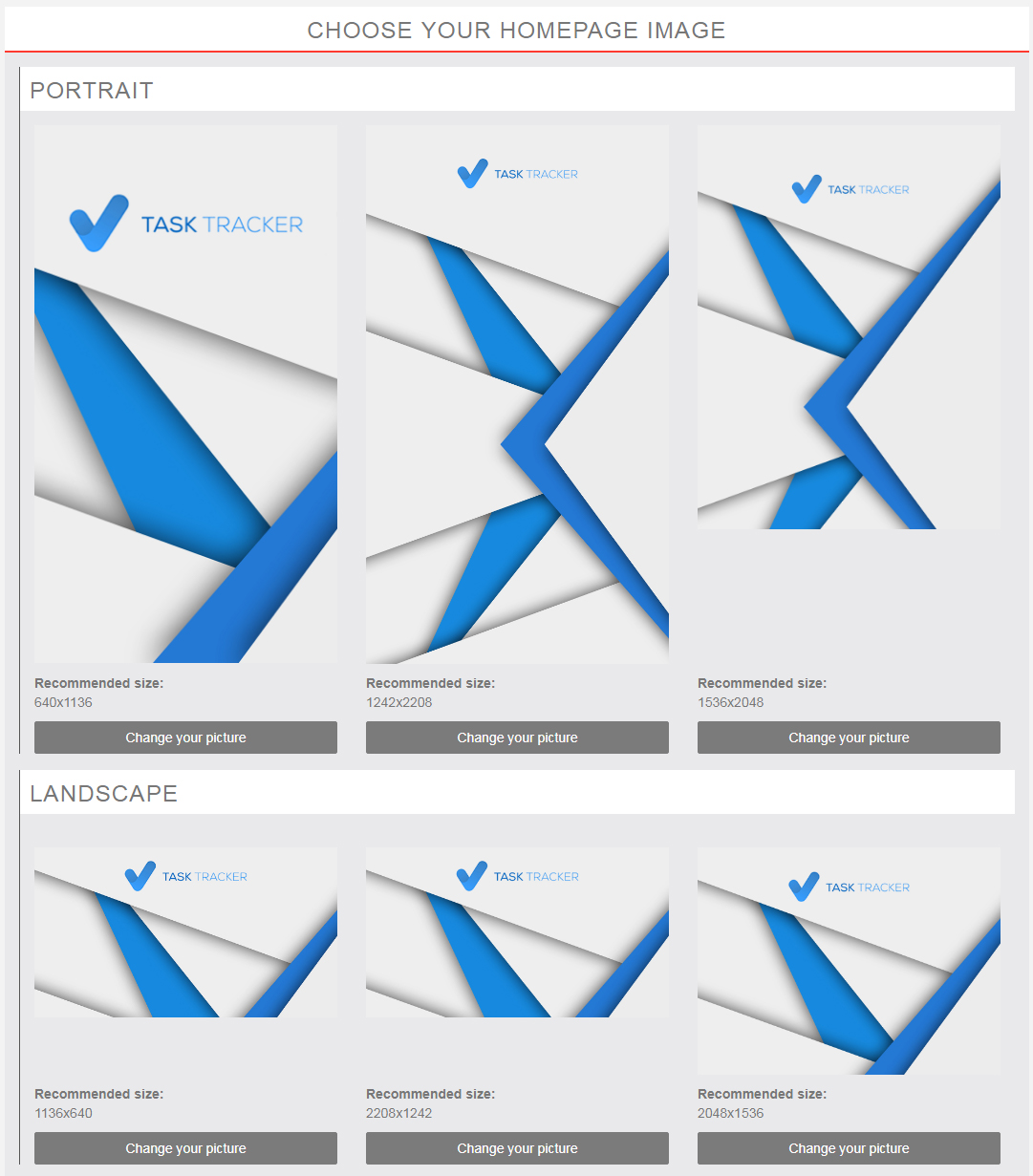
Homepage Image The next section slightly further down the page allows you to edit the background images that your app will display on the home screen. The image must be uploaded at several different sizes, in both portrait and landscape format. This is because different devices have different screen sizes and resolutions, and we want to make sure your app looks great wherever people use it! When your app goes live and you first log into the editor, there will already be homepage images in there that your designer has custom-made just for your app. But if you would like to change them, feel free! Each spot gives you recommended sizes for the images (these are measured in pixels, width x height) – but don’t worry! If your image doesn’t match those dimensions exactly, the app editor will help you crop them! |
 |
|
|
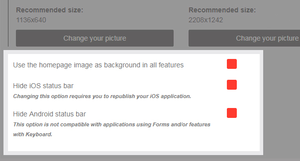
Hide Status Bars Just below the homepage image section, you’ll see a few checkboxes. The first option, “Use the homepage image as background in all features” will display the same background image behind all other pages in the app, such as your articles and forms. This can be a really nice stylistic touch, but if the background is a “busy” image with a lot of lines or contrasting colors, it might make text hard to read in some sections of the app. Most individual pages within the app will allow you to set a custom background just for that page as well. The next option, “Hide iOS status bar” applies if you purchased a Native Apple App with us and your app is published in the App Store. If you check this option, users of your app will notice that the app loads “full screen,” meaning it covers the status bar along the top of the phone that usually displays the time, battery life, etc. This is entirely up to your personal preference. The next option, “Hide Android status bar” applies if you purchased a Native Android App with us and your app is published in the Google Play store. As above, if you check this option, it will hide the status bar that typically displays the time, battery life, etc. |


