
Create Mobile Responsive Tables in an Article or Module
|
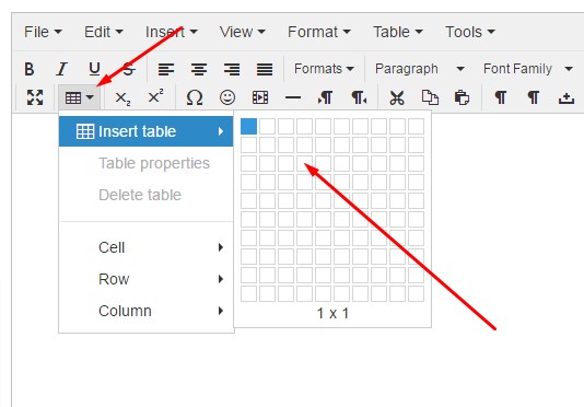
Click the table button, and select your cell and column size |
 |
|
|
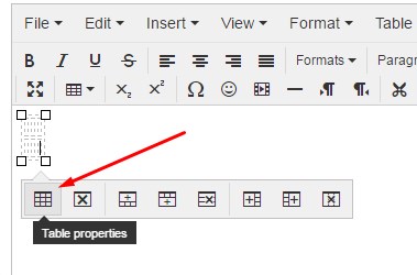
Insert Click “table properties” |
|
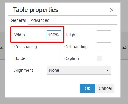
Set the table width to 100% (the percent is the important part) |
|
|
|
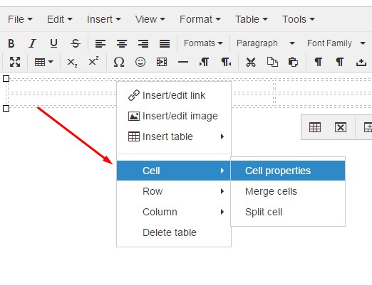
Now set each top cell width to the proportionate percentage, so that the total width of all cells equal 100% (EXAMPLE: four columns, 25% width per each top cell. Three columns, 33% width per each top cell. Two columns, 50% width per each top cell. Don’t forget the percentage sign!) |
Add your content in the desired cells.
Be sure to click “Save & Close” and flush your website cache to view your work!
Mobile Responsive Tables